


Enjoy Orbe!
Orbe specializes in producing high quality experiences. It is a brand that seeks to stand out in what it proposes to do. It comes with the objective of offering high quality specialty coffees with the ideal and vibrant flavors.
In this project, we wanted to highlight luxury and exclusivity. After a few meetings, we were able to align and define our goals: Conveying an elegant, chic, expensive and minimalist brand, aimed at the target audience of class A, aged 27-50 years.
The entire structure of the project was designed to demonstrate these attributes.
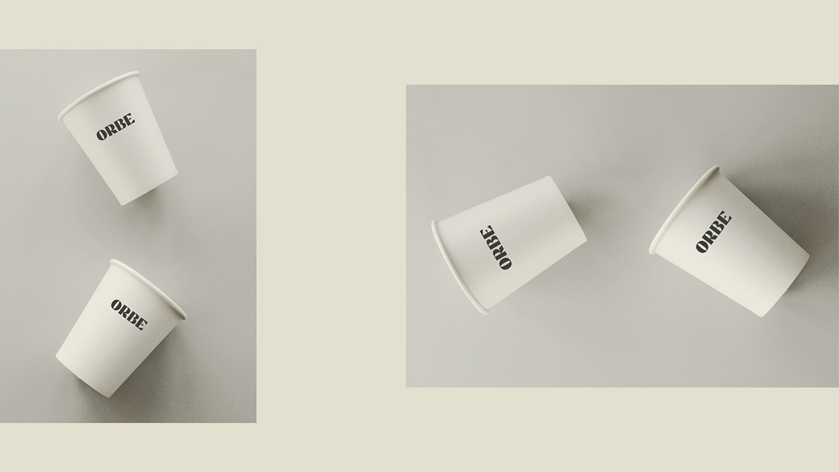
Strong and bold typography is responsible for conveying strength, quality and consistency. The colors and the Hot-Stamping finish make the packaging and other brand items even more special.
Orbe is art. Special coffee is art!
Art is calmly appreciated, right? Orbe is a high level coffee made to be enjoyed and that always invites you to another experience.
"A coffee made by special people for special people!"
It was important to put this phrase on the packaging to highlight that Orbe is a human brand and concerned with its employees and customers.
As all the elements enter into composition, the visual identity system presents the customer with all the care that the brand offers at all stages of the process. From planting to after sales.
Conclusion:
We were able to achieve the project's objectives with a visual language that was totally aimed at the target audience, with colors that take the packaging to a higher level and elements arranged to convey the image of a high-level product. We managed to reach a result capable of presenting a premium and outstanding product, making the customer perceive values in the brand.
We were able to achieve the project's objectives with a visual language that was totally aimed at the target audience, with colors that take the packaging to a higher level and elements arranged to convey the image of a high-level product. We managed to reach a result capable of presenting a premium and outstanding product, making the customer perceive values in the brand.

Enjoy Orbe!
Orbe é especializada em produzir experiências de alta qualidade. É uma marca que busca se destacar no que se propõe a fazer. Vem com o objetivo de oferecer cafés especiais de alta qualidade com os sabores ideais e vibrantes.
Neste projeto, queríamos destacar o luxo e exclusividade. Depois de algumas reuniões, conseguimos alinhar e definir nossos objetivos: Transmitir uma marca elegante, chique, cara e minimalista, direcionada ao público alvo de classe A, de 27-50 anos.
Toda a estrutura do projeto foi pensada para demonstrar esses atributos.
A tipografia forte e arrojada é responsável por transmitir a força, qualidade e consistência. As cores e o acabamento em Hot-Stamping fazem as embalagens e os outros itens da marca serem ainda mais especiais.
Orbe é arte. Café especial é arte!
Arte se aprecia com calma, certo? Orbe é um café de alto nível feito para ser apreciado e que sempre te convida para mais uma experiência.
"Um café feito por pessoas especiais para pessoas especiais!"
Foi importante colocar essa frase na embalagem para destacar que Orbe é uma marca humana e preocupada com seus colaboradores e clientes.
À medida que todos os elementos entram em composição, o sistema de identidade visual apresenta ao cliente todo o cuidado que a marca oferece em todas as etapas do processo. Desde a plantação à pós venda.
Conclusão:
Conseguimos atingir os objetivos do projeto com uma linguagem visual totalmente direcionada para o público alvo, com cores que levam a embalagem à um nível superior e elementos dispostos para passar a imagem de produto de alto nível. Conseguimos chegar em um resultado capaz de apresentar um produto premium e de destaque, fazendo com que o cliente perceba valores na marca.

-
-
-

-
-
-

-
-
-


-
-
-

-
-
-

-
-
-

-
-
-

-
-
-


-
-
-

-
-
-


-
-
-


-
-
-

-
-
-


-
-
-

-
-
-


